- What is a Radar Chart?
- Data Format
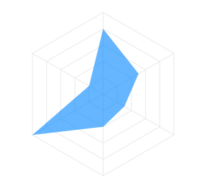
- Fill
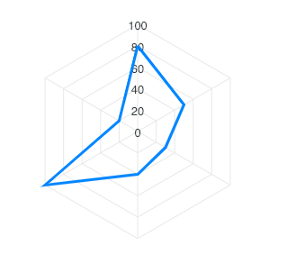
- Stroke / Borders
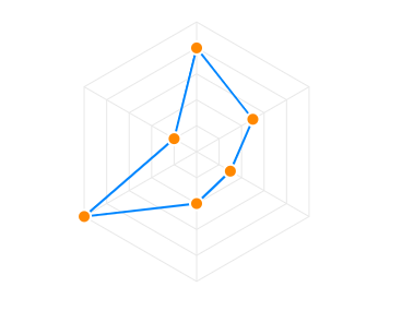
- Markers
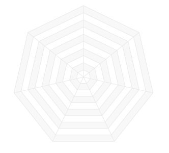
- Customizing the polygons
- Customizing the Y-axis labels
- Customizing the X-axis labels
- Customizing the Data Labels
Radar
What is a Radar Chart? #
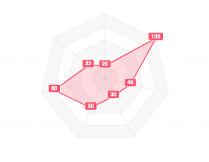
The radar chart, also known as spider chart or web chart is equivalent to a parallel coordinates plot in polar coordinates. It is a web-shaped diagram used to indicate the relative influence of different numerical parameters. The values are plotted on scales that radiate out of a point and are then connected to each other.
Data Format #
The data format for the radar chart is the same as used on other axis-based charts (line/bar).
$data = [
    [
        'year',
        'series-1',
        'series-2',
        'series-3',
    ],
    [
        "2011",
        80,
        20,
        44
    ],
    [
        "2012",
        50,
        30,
        76
    ],
    ...
];
\koolreport\apexcharts\RadarChart::create(array(
    "title" => "Radar Chart - Multi Series",
    "dataSource" => $data,
    "columns" => array(
        "month" => [
            "label" => "Month"
        ],
        "series-1",
        "series-2",
        "series-3",
    ),
Fill #
You can fill the area inside radar as well as apply opacity to the filled area.
'options' => [
    'fill' => [
        'opacity' => 0.5,
        'colors' => []
    ]
]
Full documentation for fill can be found at options.fill
Stroke / Borders #
The lines used to draw the radar can be customized in the following way.
'options' => [
    'stroke' => [
        'show' => true,
        'width' => 2,
        'colors' => [],
        'dashArray' => 0
    ]
]
Full documentation for stroke can be found at options.stroke
Markers #
The markers are the circles which appear on data-points useful on displaying tooltips when user hovers over them.
The markers can be customized in the following way.
'options' => [
    'markers' => [
        'size' => 5,
        'hover' => [
            'size' => 10
        ],
    ]
]
Full documentation for markers can be found at options.markers
Customizing the polygons #
The polygon lines of the radar chart are the equi-angular spokes, called radii, which looks like a spider’s web.
The styles of this polygon can be controlled by the plotOptions.radar.polygons property as below.
'options' => [
    'plotOptions' => [
        'radar' => [
            'polygons' => [
                'strokeColor' => '#e8e8e8',
                'fill' => [
                    'colors' => [
                        '#f8f8f8',
                        '#fff'
                    ]
                ]
            ]
        ]
    ]
]
Customizing the Y-axis labels #
The labels that appear on the vertical line of radar chart can be controlled by yaxis property in the configuration.
Customizing the X-axis labels #
The labels that appear outside the radar chart can be enabled/disabled by setting xaxis.labels.show. Please note that not all properties of xaxis are applicable in case of radar chart as this chart is a little different as compared to other XY charts. Only the keys listed below are applicable for xaxis of radar chart.
'options' => [
    'xaxis' => [
        'categories' => [
            'April',
            'May',
            'June',
            'July',
            'August',
            'September'
        ],
        'labels' => [
            'show' => true,
            'style' => [
                'colors' => [
                    '#a8a8a8'
                ],
                'fontSize' => '11px',
                'fontFamily' => 'Arial'
            ]
        ]
    ]
]
Customizing the Data Labels #
The labels that appear on the data-points of the radar chart are knows as datalabels.
Data labels can be customized by the following way
'options' => [
    'dataLabels' => [
        'enabled' => true,
        'background' => [
            'enabled' => true,
            'borderRadius' => 2
        ]
    ]
]
Get started with KoolReport
KoolReport will help you to construct good php data report by gathering your data from multiple sources, transforming them into valuable insights, and finally visualizing them in stunning charts and graphs.