- What is a Bar Chart?
- Data Format
- How to make a bar chart
- Basic Horizontal Bar Chart
- Adding markers
- What is a Stacked Bar Chart and how to plot one?
- Reversed Chart
- When to use a Bar Chart?
Bar Chart
What is a Bar Chart? #
Bar Charts (also Bar Graphs) are among the most common types of charts used for displaying comparisons between several categories of data and variations of different values. A bar chart is oriented horizontally or vertically using rectangular bars with different lengths that are proportional to the value they visualize. You can display long data labels as the horizontal rectangles have enough room to fit textual information.
There are several types of bar charts, including basic horizontal bar charts, stacked bar charts, reversed bar charts, and more.
Data Format #
The data format for a bar chart is the same as for the other XY charts. You will need to provide your data in table format.
How to make a bar chart #
In the following sections, will go through the configuration and options to plot different types of bar charts, will help you lean how to add markers on horizontal bar charts, how to display bars that are stacked on top of each other, and will show you a few bar graph examples.
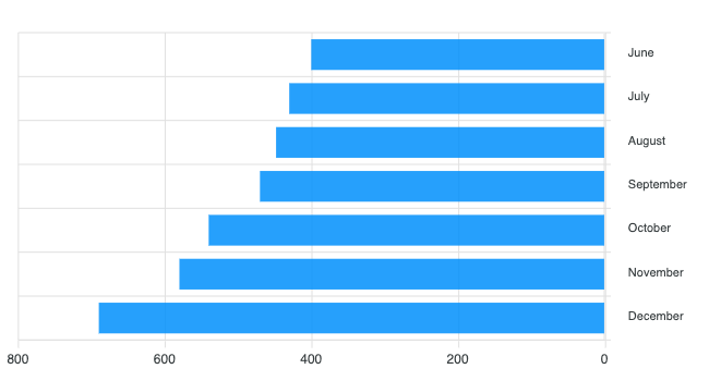
Basic Horizontal Bar Chart #
To create a basic bar chart, use the BarChart class:
\koolreport\apexcharts\BarChart::create(array(
Adding markers #
Markers on a horizontal bar chart are useful for comparisons or they can be helpful in providing additional information related to the particular data-point. To add markers, simply set a column's marker option like the following:
\koolreport\apexcharts\BarChart::create(array(
    "columns" => array(
        'year',
        'Actual',
        'Expected' => [
            'marker' => [
                'strokeWidth' => 5,
                'strokeColor' => '#775DD0'
            ]
        ],
    ),

Note: Markers don’t work with stacked charts
What is a Stacked Bar Chart and how to plot one? #
A stacked bar chart, or a stacked bar graph, is a type of Bar Chart used for breaking down a larger category into subsegments or sub-values and comparing them to see which subcategory or sub-value shares a bigger portion in the whole.
There are 2 variants of Stacked Bar Charts.
Normal Stacked Bar Charts #
The bars are stacked on top of each other based on their values.
\koolreport\apexcharts\BarChart::create(array(
    "stacked" => true

100% Stacked Bar Charts #
The bars are stacked on top of each other based on their percentage or weightage among the groups.
\koolreport\apexcharts\BarChart::create(array(
    "stacked" => true,
    "stackType" => "100%"

Reversed Chart #
A reversed bar chart is a mirrored chart that goes from right to left instead of left to right. The following configuration will make a mirrored graph.
\koolreport\apexcharts\BarChart::create(array(
    "options" => [
        'yaxis' => [
            'reversed' => true
        ]
When to use a Bar Chart? #
As Bar Charts and graphs are very easy to interpret, they are ideal for visualizing comparative data through a chart. Also, they are very suitable for scenarios like sales management, inventory management, or stock charting with some of the most common use cases including:
- When you want to show trends or variations in the value of an item across time.
- When comparing data values of one or multiple data series.
- In case you have to examine several data points grouped in sub-categories.
Get started with KoolReport
KoolReport will help you to construct good php data report by gathering your data from multiple sources, transforming them into valuable insights, and finally visualizing them in stunning charts and graphs.