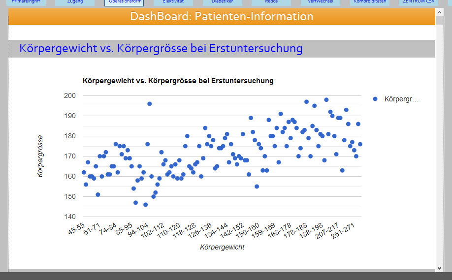
KoolReport's Forum

Official Support Area, Q&As, Discussions, Suggestions and Bug reports.
Forum's Guidelines

How to apply a trendline in ScatterChart? #736

Open Markus Mohr opened this topic on on Mar 11, 2019 - 2 comments

Markus Mohr commented on Mar 11, 2019

KoolReport 3.25.4:

The result of my ScatterChart (body size vs. body weight) looks like this:

Which kind of functionality do I need to put into this to have something like the orange line (being a trendline or trend indicator)?

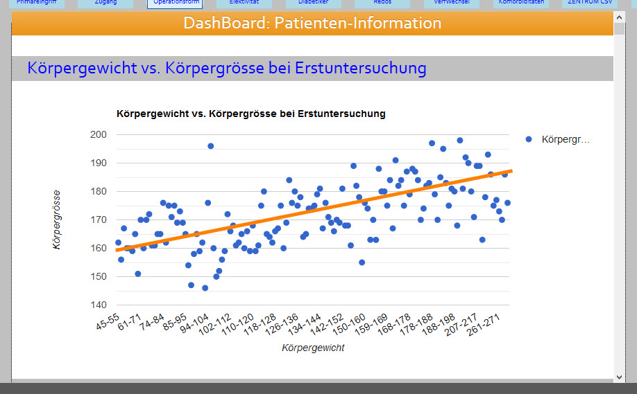
I have already read the forum threads #708 and #709, but is "trendlines" the right way to do it?

Markus Mohr commented on Mar 11, 2019

Isn't there a way to define the trendline as the difference between the min and the max value of a database record set such as

[...]
),
"options"=>array(
    "vAxis"=>array(
        "title"=>"Körpergrösse",
    ),
    "hAxis"=>array(
        "title"=>"Körpergewicht"
    ),
    "trendlines"=>array(
        array_sum(min($row['weightrange']))=>array_sum(max($row['weightrange']))
	)
)
[...]

working with average values here (weight and body size are numerical values)?

KoolReport commented on Mar 11, 2019

The trendlines are draw automatically with google charts, you may only choose the option with "line", "exponential" or "polynomial". For the "line", I guess google use "least square" algorithm. Please follow this post to add trendline to ScatterChart. The options for drawing trendline in ScatterChart is the same.

Build Your Excellent Data Report

Let KoolReport help you to make great reports. It's free & open-source released under MIT license.

Download KoolReport View demo
help needed

None