KoolReport's Forum

Official Support Area, Q&As, Discussions, Suggestions and Bug reports.
Forum's Guidelines

Multiple category by period bar/column chart #735

Closed Daniel Amamoo-Otchere opened this topic on on Mar 10, 2019 - 1 comments

Daniel Amamoo-Otchere commented on Mar 10, 2019

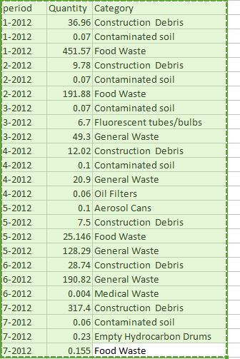
Hello Kool team, I am trying to develop the chart to show the following data with the following info x -axis => period y-axis=>quantity legend category => Category One major issue is how can I introduce the legend category which is different series without having to name them one by one. This is coming from the database direct and can be many. All I will want is to pass the options the user will want to plot to the chart for it to display the appropriate chart.

Is there anyway this can be done dynamically?

The data is shown below.

KoolReport commented on Mar 11, 2019

You will need to use the Cube process with the row is period and column is the category, you sum the quantity. As a result, you will get a table in which the first column is grouped by period and series of columns which are category. And the value in table will be the sum of each category on each period. Send this data to ColumnChart, you will get the xaxis is the period, and on each period, you will have several columns, each column represent sum quantity of a category for that period.

Build Your Excellent Data Report

Let KoolReport help you to make great reports. It's free & open-source released under MIT license.

Download KoolReport View demo
None yet

None